PROJECT Summary
June 2020
This work is done to provide general guidelines to designers and developers when creating data visualizations in various forms throughout OnPoint Products. We utilize data visualization for analysis, monitoring, and proactive industrial asset management across multiple software products. Our different software products are unified in a digital ecosystem, so it is important to have a singular design language.
Tools:
Sketch
Stark plugin
Ideation
Use Case
Dashboard with widget
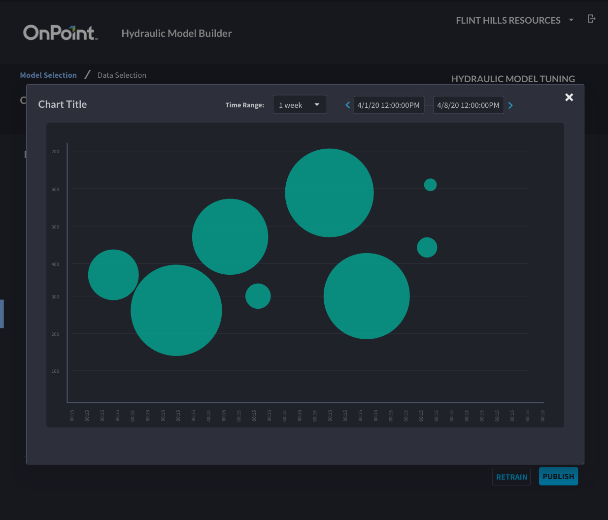
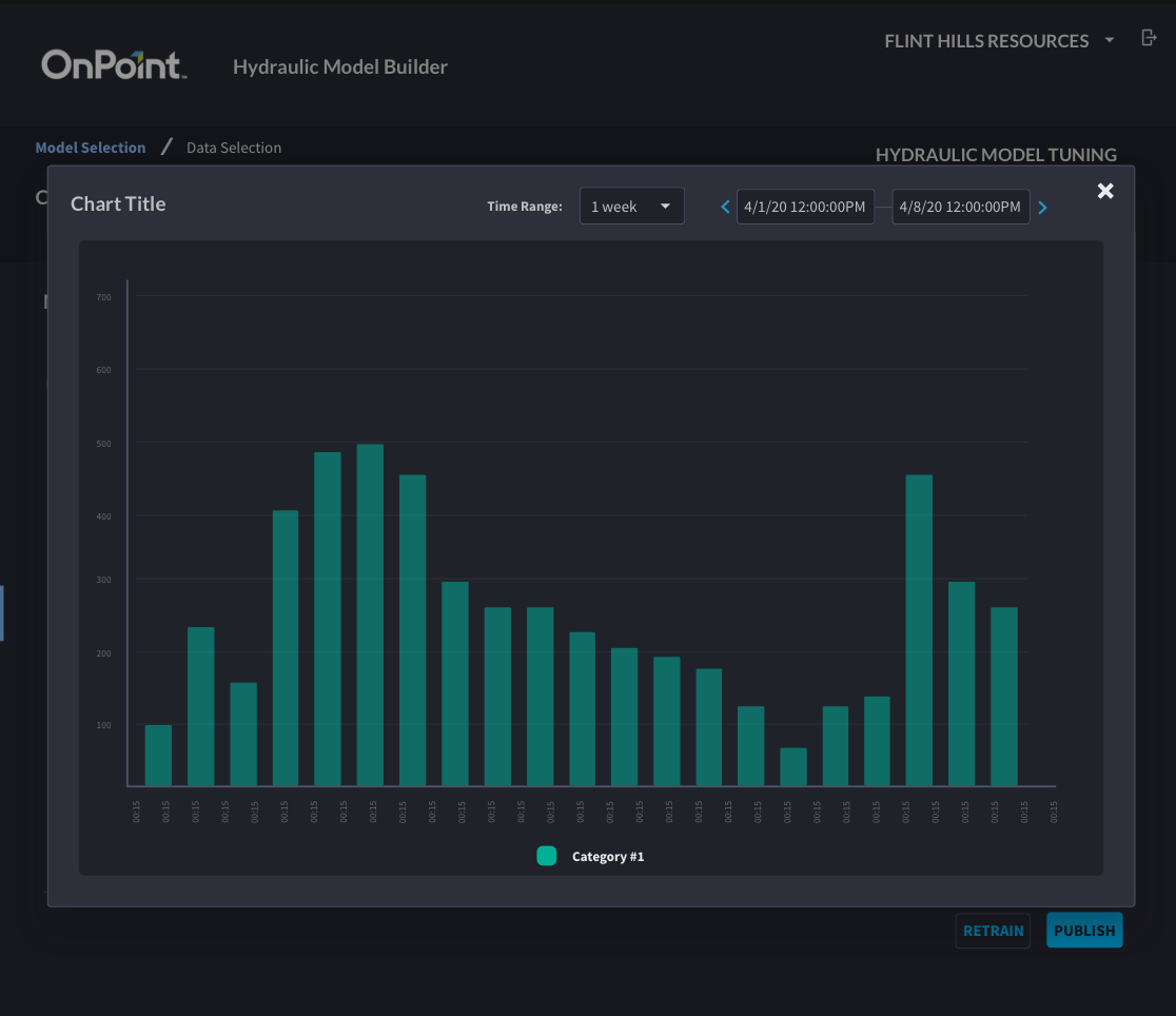
Throughout OnPoint products, we utilize data visualizations as a way for users to draw insights from their data. We provide visualizations for analysis, proactive asset management, and quick insights. Data visualizations often come in two forms in our products, “widgets” and tools. “Widgets” are used in asset dashboards for monitoring and can convey quick insights of various forms of data. Tools are larger, interactive data visualization interfaces that allow users to perform deep analysis of data. “Widgets” will typically be conveying information on one variable, whereas tools include many variables that are related.
User Problem
Most of the data that we work with is time series data from SCADA historians. SCADA refers to an overall system that monitors and controls different networked devices, for our clients that typically revolves around industrial process plants. Historian data is drawn from various devices and sensors throughout a process plant, resulting in very large amounts of data. Users need to have the ability to analyze this data to find out ways that they can improve process performance, data visualization plays a key role in that goal.
Design
Accessibility
Accessibility is a critical consideration to achieve an effective user experience. While designing these style guidelines in Sketch, I utilized a great plugin called Stark that allows you to simulate different types of colorblindness.
It is difficult to address every edge-case effectively, but this tool allows designers to quickly check the accessibility of their designs.
I used it to ensure that our categorical colors would meet contrast requirements in three types of colorblindness.
Base Components
The base components for design use in data visualizations gives a defined palette that can be used across products to ensure a consistent design language.
By having a standardized set of base components we can make design and development easier. Most of these components are used in other areas of the OnPoint Design System, so it ensures consistency with other elements in our digital products
Example Usage
Next Steps
It is imperative to work with the development team to refine and implement these style guidelines. Through that collaboration there may be changes in categorical colors or other details, but achieving alignment is the top priority.


