PROJECT Summary
July 2019 - October 2019
This visual tool was designed for use in the model creation process of OnPoint’s machine learning product, CORTEX. The goal of this tool was to provide users the ability to visualize their data to better understand relationships between variables before creating a machine learning model.
Tools:
Sketch
InVision
Ideation
Domain Research
CORTEX is a machine learning platform that is intended to provide data science capabilities to non-data scientists. I interviewed two of OnPoint’s data scientists to understand the gaps in understanding that might not be evident to someone that is well-versed in data science.
The difficult challenge in that endeavor is that it can be very difficult to leverage data science effectively without some level of knowledge on how to apply it in the right instances. I learned that the appropriate ML algorithm to use to solve a problem is very data-dependent. That means that it is important to understand the data set and the relationships between variables to identify the best algorithm to apply.
Data scientists may use various methods to understand a data set, one of these methods is creating visualizations utilizing Python or R.
Seaborn pairplot created with Python
User Research
The CORTEX platform is utilized by a team within OnPoint called Advanced Analytics Process Engineering Solutions (AAPES) to solve problems for clients in a consulting fashion. Our engineers in this team will work with clients to identify issues within their facilities that are hard to understand and resolve. Our engineers will use their expertise to study the problem and develop creative solutions that are beyond traditional process operations.
I interviewed a number of these engineers to understand pain points that occur when they are analyzing an issue and identify ways this project could assist in the resolution of that issue. Many of these engineers were familiar with Python or R, but a significant pain point that they experienced often was preparing a data set to be in a usable format. Issues like missing data or outliers must be addressed manually before inputting the data set into CORTEX.
User Problem
Understanding your data is an integral part of utilizing data science, the relationships between variables is important to know when creating a machine learning algorithm. CORTEX provides the ability for engineers to run ML algorithms on plant process data to determine process improvements or solve vague problems occurring within the plant. The amount of data available from plant historians often makes this a challenge, some variables are well understood, but when working with hundreds or thousands it can be difficult to know which variables are important.
Solution Statement
This is a challenge that we often experienced utilizing CORTEX, so we decided to provide a means of understanding large amounts of data and the relationships between large numbers of variables. We wanted to help users more effectively apply machine learning to their data and we wanted to drive that by allowing them to explore their data visually. While many of our users are capable of creating their own visualizations using Python or R, we wanted to expand that ability to users that are unfamiliar with those methods. We can also reduce manual processes by providing this visualization without code capability. Taking that a step further, we will give users the ability to curate their data during this visualization process, giving them the ability to remove sections of the data that contain missing data points or outliers.
Design
Sketches
Wireframes
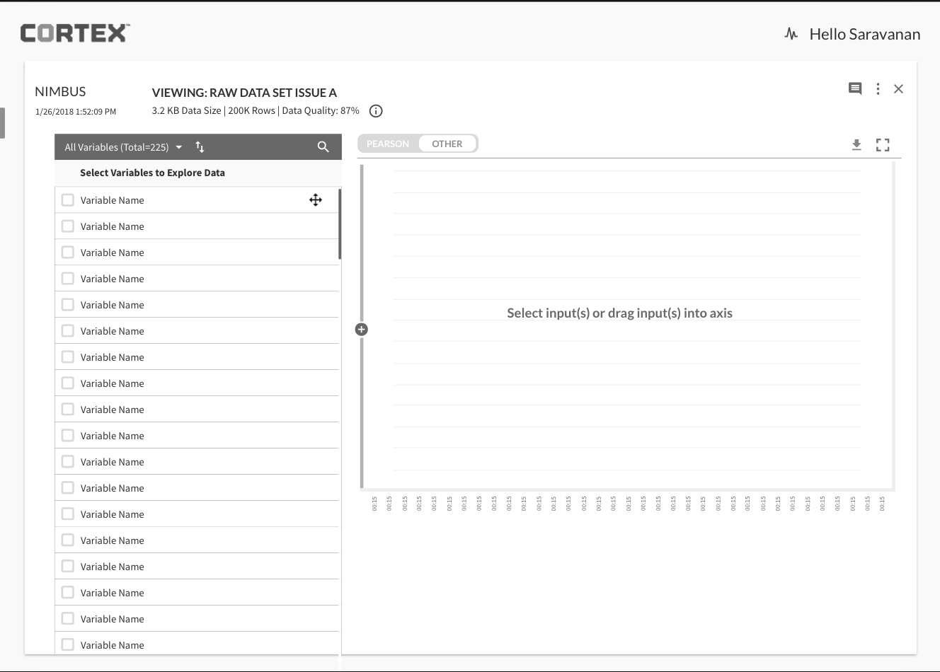
Iterations
Final Screens
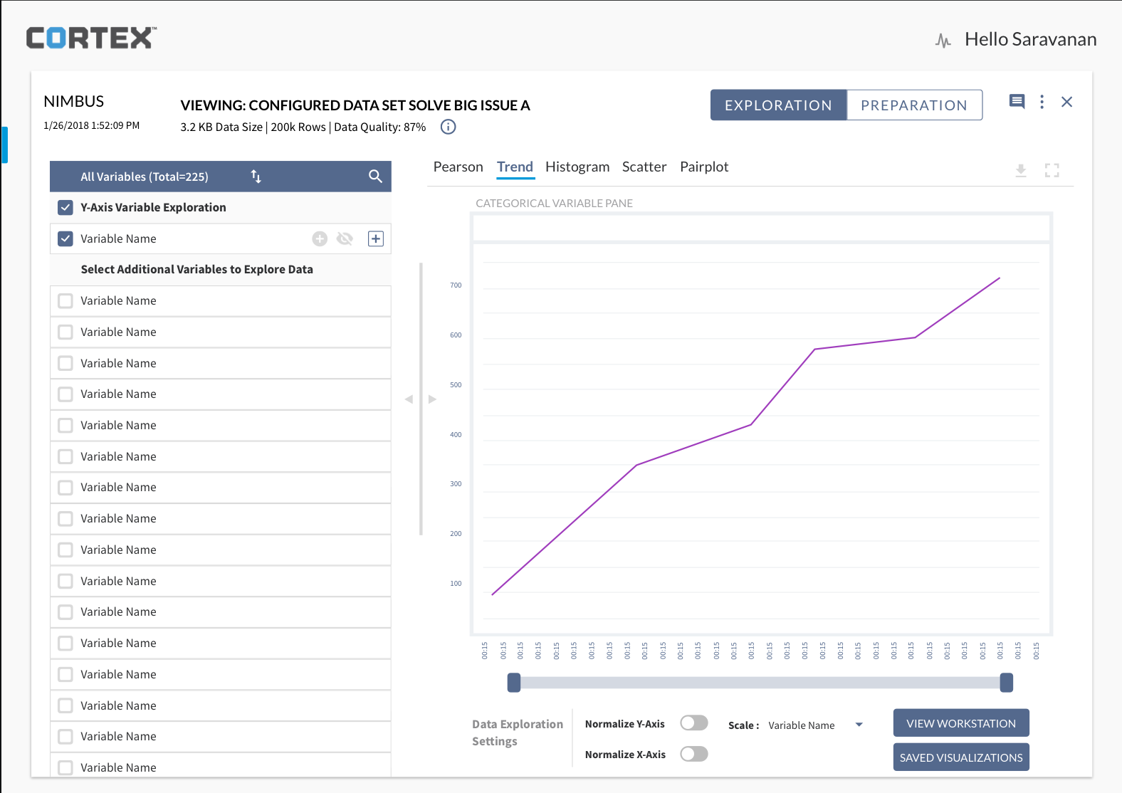
This is a small selection of the final screens I designed for Data Exploration.
If you would like to see a larger set of examples please view my Data Visualization case study on Cortex Data Exploration.


Categorical Variables
Often a data set processed through CORTEX contains both continuous and discrete variables. It can be helpful to understand the relationships between these different variable types. Providing the ability to overlay the presence of a discrete variable on a visualization of a continuous variable can give some context on the relationship.


Data Preparation
The Data Preparation piece of this project allows users the ability to remove data from a data set and to create enriched variables through visual selection.
A user can select periods of a data set and remove those sections if there are issues like missing values or outliers. Due to most of the data processed in CORTEX being time-series data, all of the data for the selected period would be removed.
A user can also select sections of data a create an enriched variable. This allows the user to identify instances in the data set and create a categorical variable. That categorical variable can then be identified throughout the data set, allowing the user to label data behavior for quick recognition on further analysis.


Next Steps
This project was handed over to another designer when implementation began and I was assigned to some new initiatives. CORTEX as a product currently exists as a stand alone software platform. We are currently looking at integrating CORTEX into the larger digital ecosystem that we have been creating.
Data Exploration is a valuable tool for the model setup process, but it also has much value as a purely data analysis tool. We will be looking at how we can leverage the visualization capability in other use cases.
Conclusion
This project was the first large feature set that I worked on after joining EFT Analytics. I was the sole designer working on this with some feedback from the rest of the design team. It was a new experience managing my workload to meet delivery times for development teams. I worked on this product in stages, first the Exploration piece, and then later the Preparation piece. It was very challenging to create a design that could handle the large number of variables that these data sets can contain. I had multiple interactions with the AAPES team to present my work and receive feedback, but it could be informal and I learned the value of structure in the design process.


